Herbie Mann – Push Push album art
Published November 8, 2026 · JAZZ
Contributed by Ryan BrotherstonAtlantic Records. License: All Rights Reserved. Herbie Mann (1930–2003) was an American jazz flautist, and among the earliest musicians to tap into what would later become known as the world music genre with his bossa nova and…
Herbie Mann, a prominent American jazz flautist born in 1930, was instrumental in blending jazz with global musical influences, notably Latin and bossa nova styles. By 1971, Mann had already established himself as a versatile and prolific artist, with Push Push marking his 56th album as a bandleader within just over fifteen years.
Released on July 1, 1971, Push Push arrived under Embryo Records, Mann’s imprint of the major label Atlantic Records. The album showcased a fusion of jazz with contemporary sounds, featuring an impressive lineup of accomplished musicians. Guitarist Duane Allman, bassist Chuck Rainey, and drummer Bernard Purdie lent their considerable talents to the project, helping to shape its distinctive sound.
Related stories
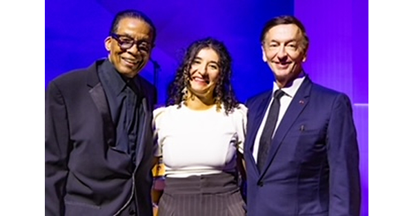 Malou Oheix from France Wins First Place in 2026 Herbie Hancock Institute International Jazz Vocals Competition at Fondation Louis Vuitton
 Semifinalists Announced for 2026 Herbie Hancock Institute International Jazz Vocals Competition, October 10-11 in Paris
 What Miles Davis Taught Herbie Hancock: In Music, as in Life, There Are No Mistakes, Just Chances to Improvise
The album’s cover art is notable for its bold visual presentation. Photographed by Joel Brodsky, it depicts Mann shirtless, clutching his flute over his shoulder against a dark backdrop. The image’s stark, intimate quality contrasts with the album’s burnt-orange typography, where Mann’s name and the title Push Push are set in the Davison Bimbo Solid typeface and positioned in the upper left corner.
This design goes beyond a conventional album cover through its innovative use of die-cut typography. The second “Push” in the title was originally die-cut, revealing a hidden image beneath when the gatefold was opened. This concealed layer presented a duotone portrayal of two lovers in an intimate embrace, a provocative choice that reflected the era’s evolving cultural attitudes.
Inside the gatefold, the album title is rendered in a unique boustrophedon style, where the text direction alternates line by line with the bottom line flipped vertically. Supporting liner notes and additional textual elements were set in Zapf’s Optima font, contributing further to the album’s sophisticated visual identity.
Later reissues of Push Push removed the die-cut feature, restoring the complete lettering of the second “Push” and eliminating the hidden image. This original design approach has since inspired typographic creativity, leading to the development of a digital typeface named Herbie Mann (released around 2020 by GautFonts). This digital font extrapolates the album’s distinctive lettering into a full character set, extending Mann’s visual legacy into contemporary design.
Musically, Push Push stands as a testament to Herbie Mann’s adventurous spirit, blending jazz improvisation with elements from rock, rhythm and blues, and world music traditions. The collaboration with Duane Allman, known for his work in southern rock and blues, underscores the album’s cross-genre appeal and Mann’s openness to musical experimentation.
Although the album’s artistic and sonic innovations are well documented, detailed accounts of the recording process and the album’s reception at the time remain limited. Nonetheless, Push Push remains a significant entry in Herbie Mann’s extensive discography, exemplifying his role as a pioneer of jazz fusion and world music integration.
Herbie Mann’s career spanned several decades until his passing in 2003, and his influence continues through both his recordings and the visual artistry associated with his work. The Push Push album, with its daring cover art and genre-blending music, offers a compelling glimpse into a transformative period in jazz history and album design, as reported by fontsinuse.com.
Full story & global impact
This article was synthesized and rewritten by MusicTop Editorial from reporting published by fontsinuse.com. Read the publisher's report for the complete source context.
Read original source: fontsinuse.com